A large sliding wood screen becomes the centerpiece for this extra-special small apartment design.
Named ‘Boneca Apartment’ (doll’s house in Portuguese) by the client, designed by Brad Swartz Architects, and photographed by Tom Ferguson, this 258 square foot (24 square meters) home remodel in Sydney, Australi, really makes the most of a tiny space.
Remodel Approach
The existing 1960’s apartment was in terrible condition and had a generic studio layout plan.
The biggest asset was the fact that the home had windows on two sides of the unit with high windows on the entry side and large windows on the opposite side.
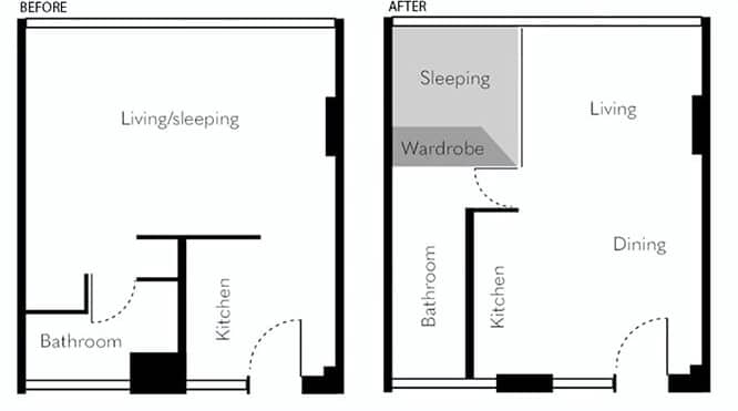
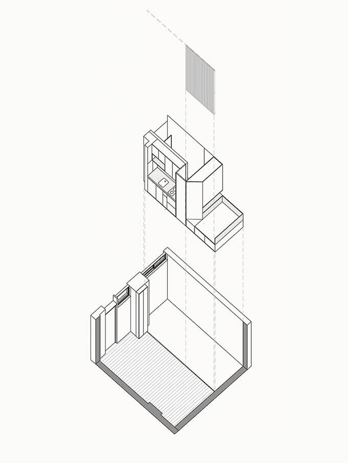
The design team opened up the dining and living room volume by sliding the kitchen over and rotating the bathroom.
Two rectangular activity zones were added to the floor plan – one for dining / living and the other for kitchen / bathroom / wardrobe / and sleeping.
Sliding Wood Screen
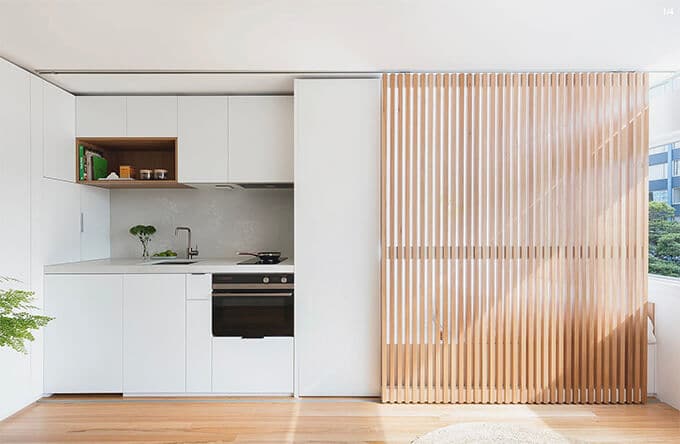
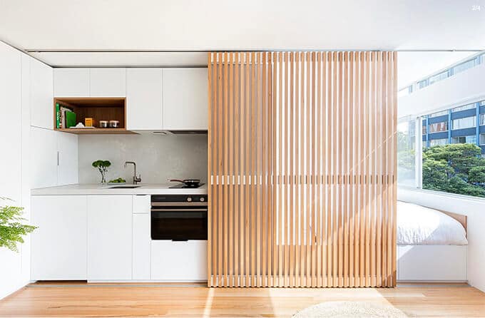
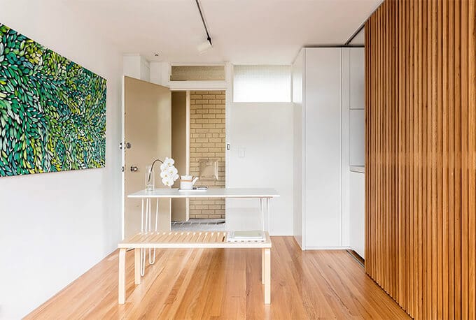
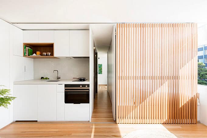
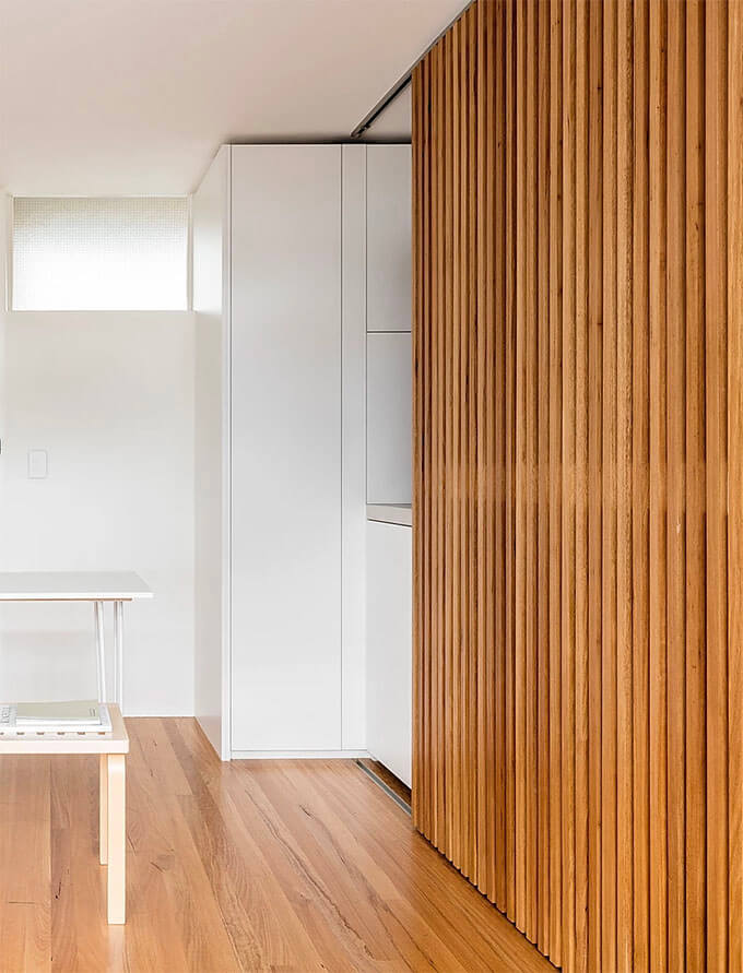
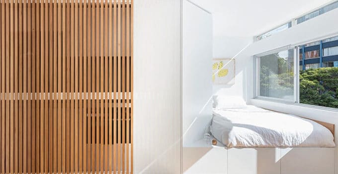
A sliding wood screen is located between the two activity zones in the apartment and made from the same material as the floor.
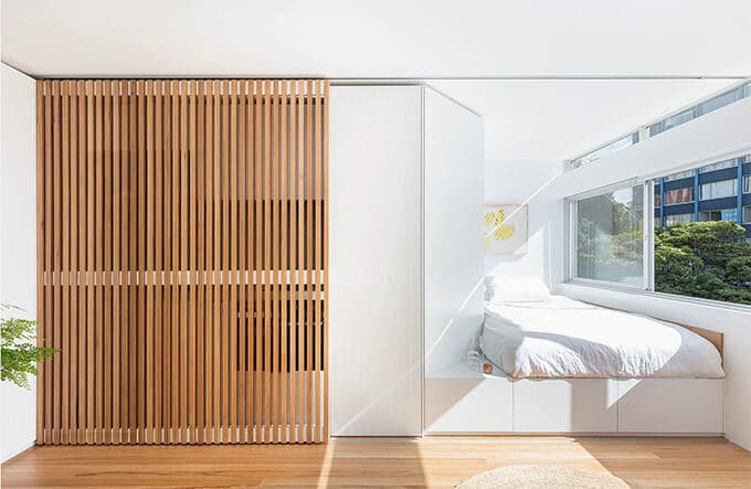
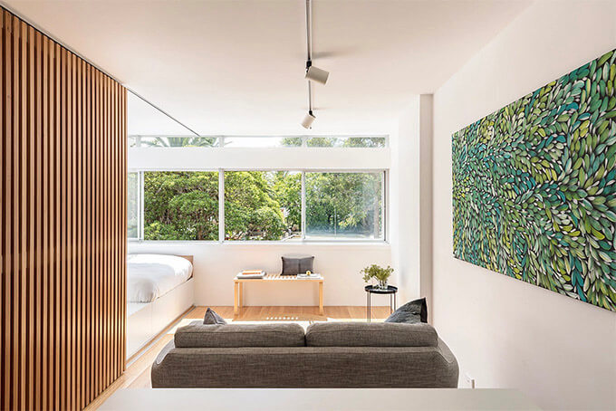
This screen hides the bed during the day but allows for cross ventilation of fresh air from the windows while retaining a sense of openness needed for this small apartment design.
Living/Dining Zone Opens to the View
The generous dining and living room zone has a focal point of the exterior treetops. The wardrobe edge is angled, creating a forced perspective towards the view and, at the same time, allowing more natural light to penetrate the apartment.
Sleeping Niche
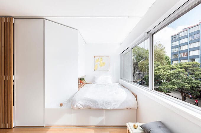
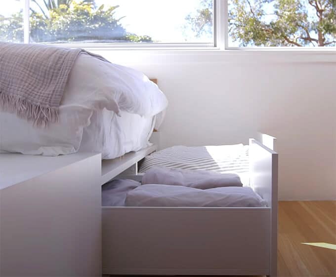
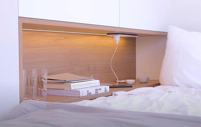
A sleeping niche, located next to fresh air and sunlight, is a raised platform to allow for storage drawers underneath. A handy bookshelf with recessed lighting and an electrical outlet is adjacent to the bed for easy access.
Secret Door
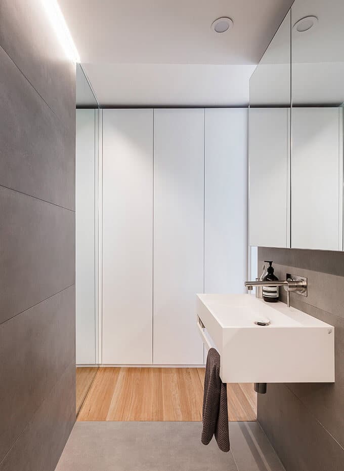
A wall panel between the kitchen and the sleeping niche opens with a touch-latch. Behind this door is a hidden bathroom and wardrobe. The designers have placed a full-height mirror in line with the bathroom entry door making this corridor seem more significant than it truly is.
Wardrobe
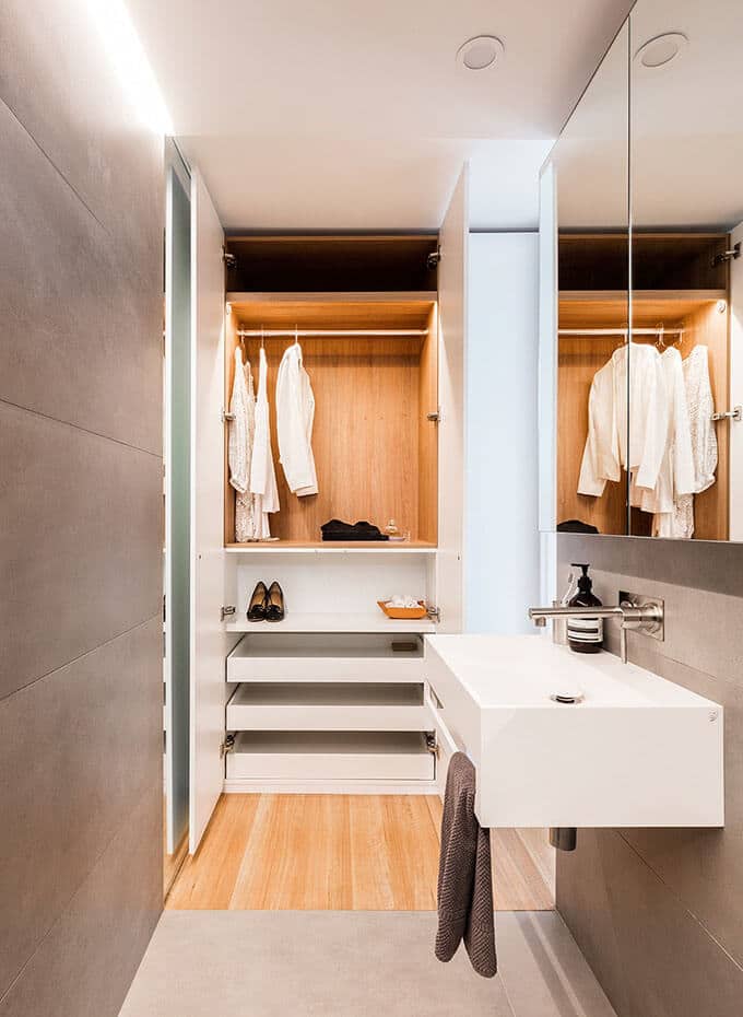
A built-in wardrobe sits between the sleeping niche and the bathroom.
Bathroom
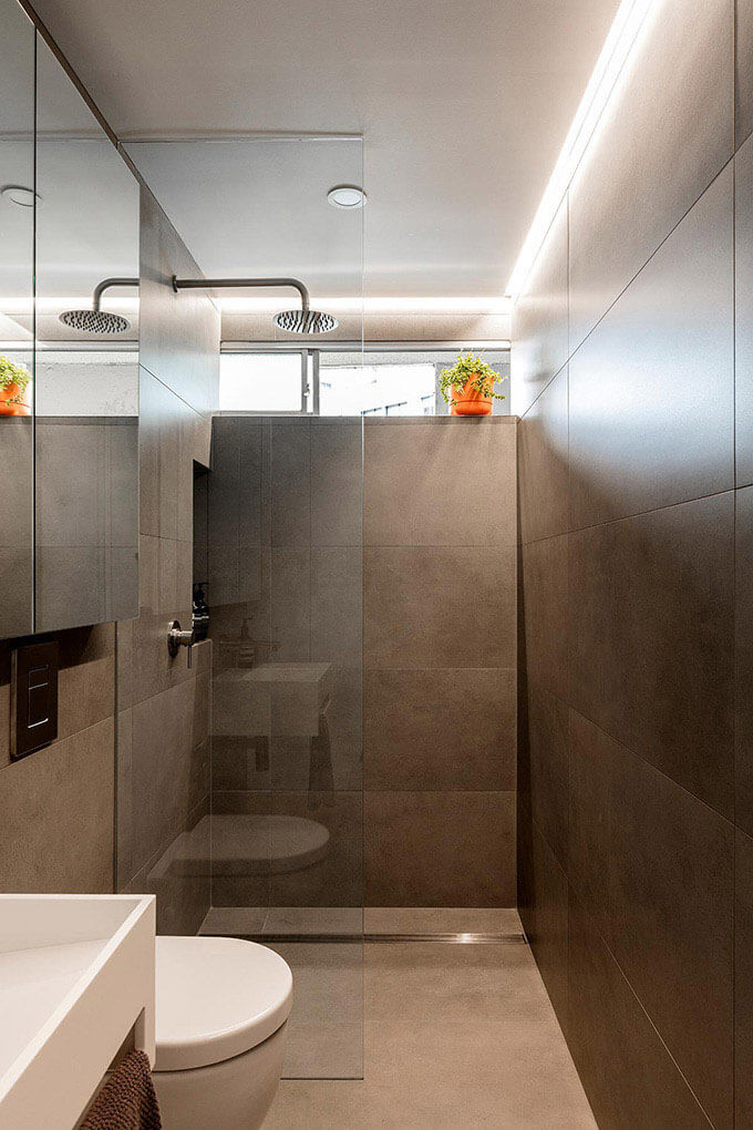
Gray tile covers the bathroom walls and floor. The color and the large tile size add a quiet and calm mood to the overall bathroom design.
A long mirrored medicine cabinet over the sink and toilet helps to enlarge the bathroom space.
A hidden lightbox on the edge of the ceiling provides additional light for the bathing and dressing areas.
High windows on the apartment buildings entry hallway allow for the natural light and ventilation – a perfect bathroom asset to this small apartment design.
Kitchen
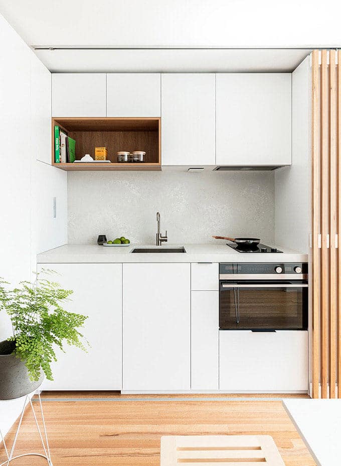
The kitchen counter and backsplash are a light gray concrete finish to stay in the color range of the bathroom.
All the necessary amenities, such as an oven, refrigerator, and pots/pans/silverware storage, have been located below the countertop.
The design team places a wooden box over the counter for open, accessible shelving. The box shelf feature makes the kitchen feel like it was thoughtfully designed and ‘not’ an off-the-shelf setup, plus it is handy for grabbing items on-the-go.
A tall cabinet to the left of the kitchen counter serves as pantry storage.
Furnishings
Beautiful art pieces and furnishings help to define and give personality to subspaces in this small apartment design.
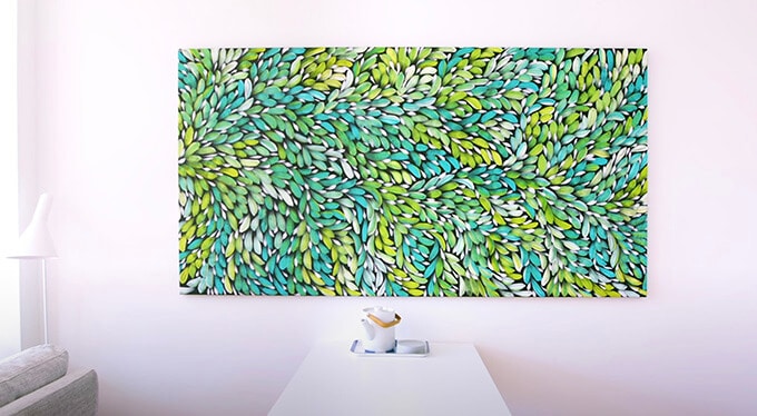
The owner chose a green abstract painting in the living room that suggests another large window in the room looking out into green foliage. The location of the art piece is an intelligent way to make the tiny apartment feel more significant in size. Plus, there is nothing like a room with a work of art you love.
A white AJ Floor Lamp by Louis Poulsen further demonstrates the owner’s exceptional taste in quality design. This lamp is a perfect complement to this project.
Small Apartment Design Takeaway
The beauty of the Boneca Apartment is in the high quality of design in every aspect of this home. Working with minimal space, the design team divides the floor span into activity zones giving the living and dining area the largest floor area. A sliding wooden screen opens and closes between the two main zones giving a dynamic quality to the home throughout the day. The choice of materials, proportions, details, and furnishings make this small apartment design a Little Giant.
Boneca Apartment Tour by the Architect
The architect discusses the Boneca Apartment design and gives a tour at the Never Too Small channel on Youtube.
Another Small Apartment Design
Visit another small apartment design around the same size but deals with the layout in a very different way.


This blog was… how do you say it? Relevant!!
Finally I’ve found something which helped me. Cheers!
Great article. I will be experiencing some of these issues as well..
I love it when folks get together and share thoughts. Great website, stick
with it!
Thanks for your personal marvelous posting!
I certainly enjoyed reading it, you can be a great author.I
will remember to bookmark your blog and definitely will come back later on. I want
to encourage you to continue your great job, have a nice morning!