This modern micro apartment design subdivides the home into a public and private side with a custom white storage wall positioned between the two zones.
For this 290 square feet (27 square meters) apartment remodel, located in Sydney, Australia, designed by Brad Swartz Architects, and photographed by Katherine Lu, there is a high level of luxury incorporated into the new design of this bright and cheerful little home.
Floor Plan
In the existing floor plan the kitchen is tucked into a pocket in the front of the apartment. The design team chose to move the kitchen to the rear of the apartment to be part of the living/dining space in the public/social zone of the floor plan.
The sleeping area was moved to the old kitchen location for fresh air, natural light, and privacy.
To make space for a new laundry closet, the existing bathroom tub was removed and a shower enclosure was added.
Before

After

Main Room
Upon entering the apartment, you are greeted with a view of treetops in the open space across the street. The walls, cabinets, and ceiling are finished in vivid white to reflect light, and the natural wood floor finish warms this light.
The kitchen is tucked on the opposite side of the room and finished in black. Together with the TV, black is used as an accent color in the design. A mirror is included in the kitchen design as a backsplash for the counter, and it gives added depth and space to this micro-apartment design.


Storage Wall
A white storage wall divides the public zone and the private zone in the home. Sliding white doors for the bathroom and sleeping area have been thoughtfully included in the cabinet design.
A wood bookshelf and frame brings an organic quality into the linear and hard-edged white wall cabinet design.
The wall storage cabinet includes a cabinet for a wine storage rack, and the interior is finished in the black accent color.
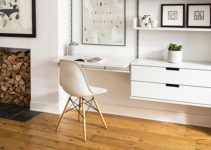
Below the flatscreen television is a convenient fold-out desk.


Bathroom
The micro apartment design includes a shower enclosure adjacent to a handy laundry closet with a stacked washer and dryer unit.
The ceiling of the entry to the bathroom is compressed to allow for storage space above. Walking through a compressed space to a more open area helps in the sense of arrival to a specific room.

Details
Thoughtful details can make any design very special. The design team includes an open space like a window over the TV that gives depth to the design and also helps with air circulation and reflected light.
The arrangement of the cabinet panels is reminiscent of Piet Mondrian painting layouts.


Bedroom
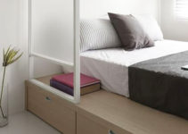
The bedroom is on a raised platform to help subdivide the room and to provide storage underneath.
The sleeping niche is designed around the dimensions of the owner’s bed with generous storage areas included over, under, and around the bed. The design team noted that the complexity of resolving the bedroom storage design to take advantage of every inch of space was like solving a Tetrix Puzzle.

Little Giant
The design team does an extraordinary job of creating a bright and cheerful modern home in this micro apartment design. Two distinct zones have been created, one for public activities and one for private, that help layout the revised floor plan in this successful redesign. A white-on-white interior helps to reflect light while wood and black provide accents to the design. A thoughtful layout with exceptional details makes this micro apartment design a Little Giant.
Micro Apartment Design Takeaways:
- White walls with light-colored wood produce warm reflected light
- Carve available space into subspaces both vertically and horizontally
- Keep the interior finish color/material palette small & not too busy
- Raised platforms help to define space, subdivide activities, and provide storage
- An entire wall of cabinets provides needed storage and divides two zones
- Leave and an unobstructed path between windows for cross ventilation
- Add design details that are both delightful as well as useful
Images from Brad Swartz Architects.
Photography by Katherine Lu.
Another Micro Apartment Design
Visit another micro apartment design with a sliding wood screen by Brad Swartz Architects.
Photo Tour on YouTube
Please see our ONE MINUTE photo tour of this micro apartment design on Youtube!


Hey, you used to write great, but the last several posts have been kinda boringK I miss your super writings. Past few posts are just a bit out of track! come on!